Microsoft has released to testers the first preview of Microsoft Office 2010. There are not many obvious improvements, but I will point out what I have noticed in the following screenshots:
The most obvious change in the above screenshot from the Office 2010 is the color scheme, which was blue but is now white, with some glass fading near the top.
Clicking what was once the orb gives this:
It represents a nice change from the old menu, which felt a bit too much like the start menu.
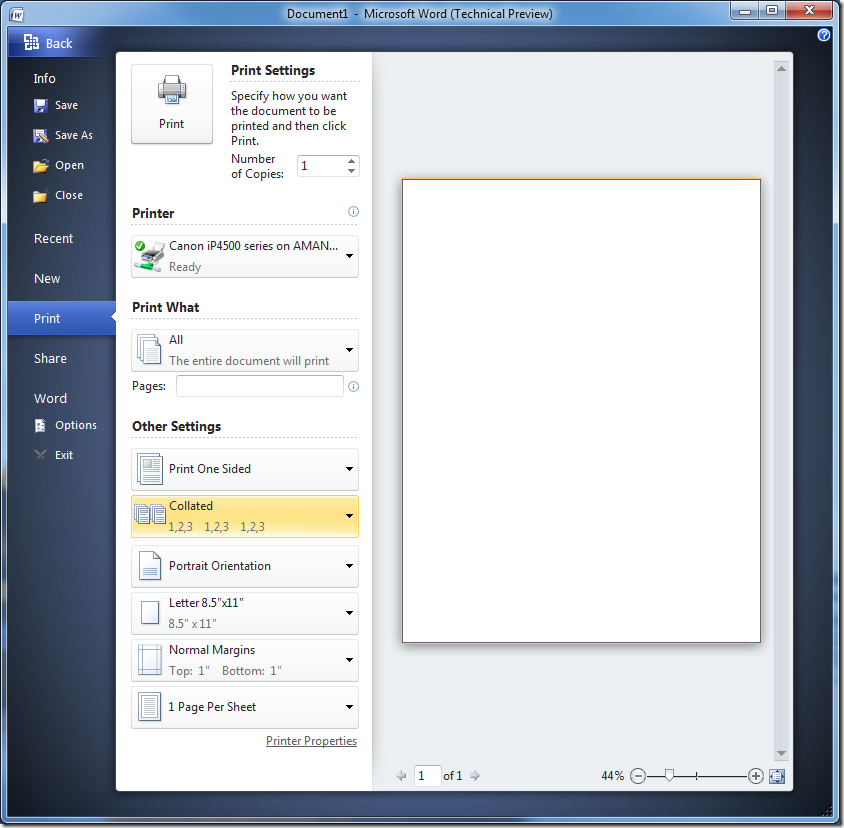
Printing options are now much more accessible, and things like printing on both sides of the paper are now much easier:
There are some nice sharing options, including sending in an email, fax, changing the file type, and sending as a pdf:
Office options are now a part of this menu:
Permissions and versions are now much easier to deal with:
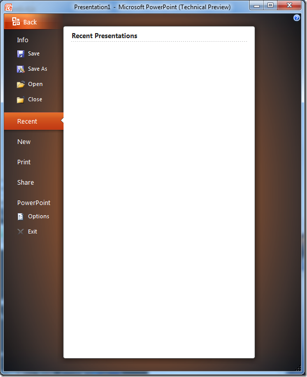
The color schemes behind the various office products are now more pronounced:
Part two will cover specific changes to Word.


No comments:
Post a Comment